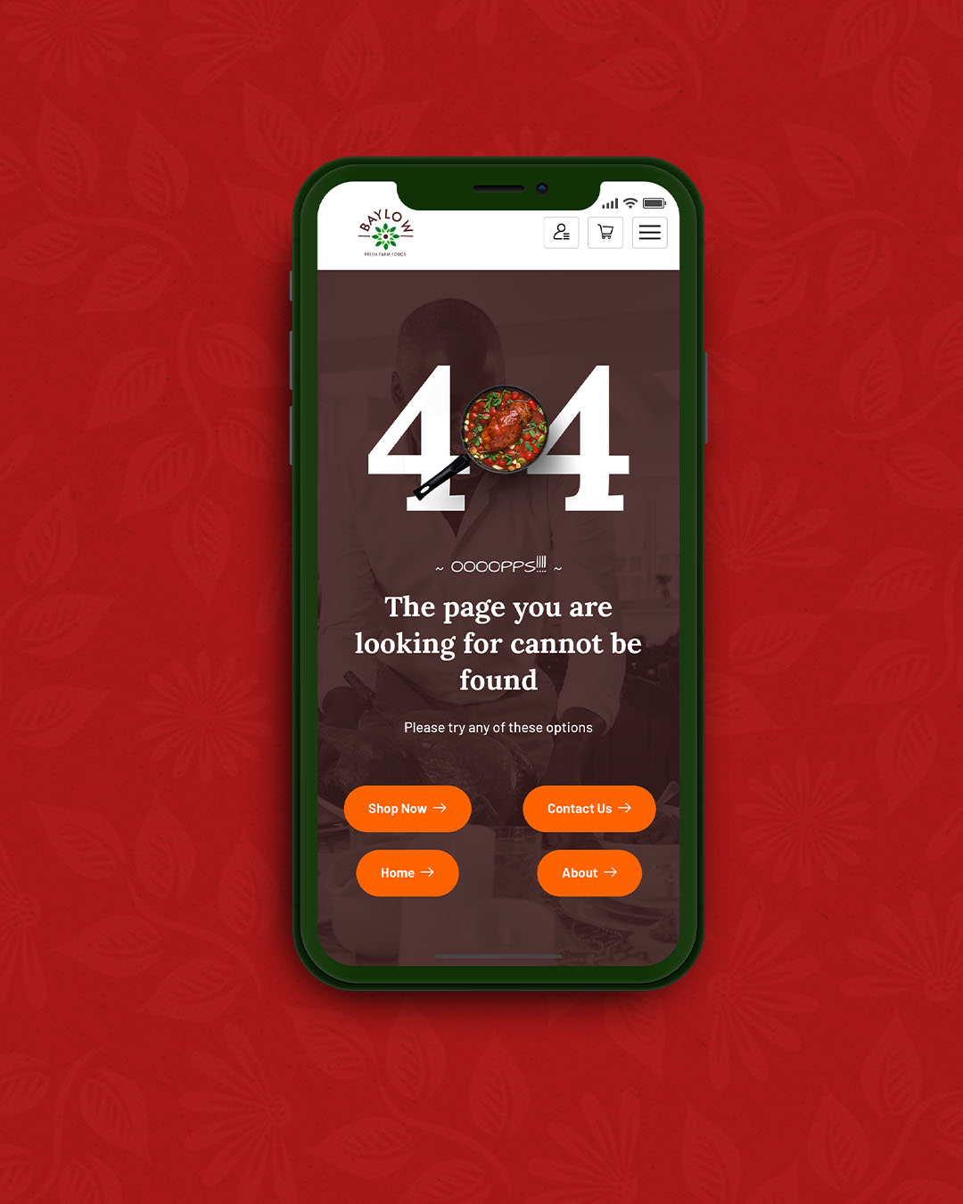
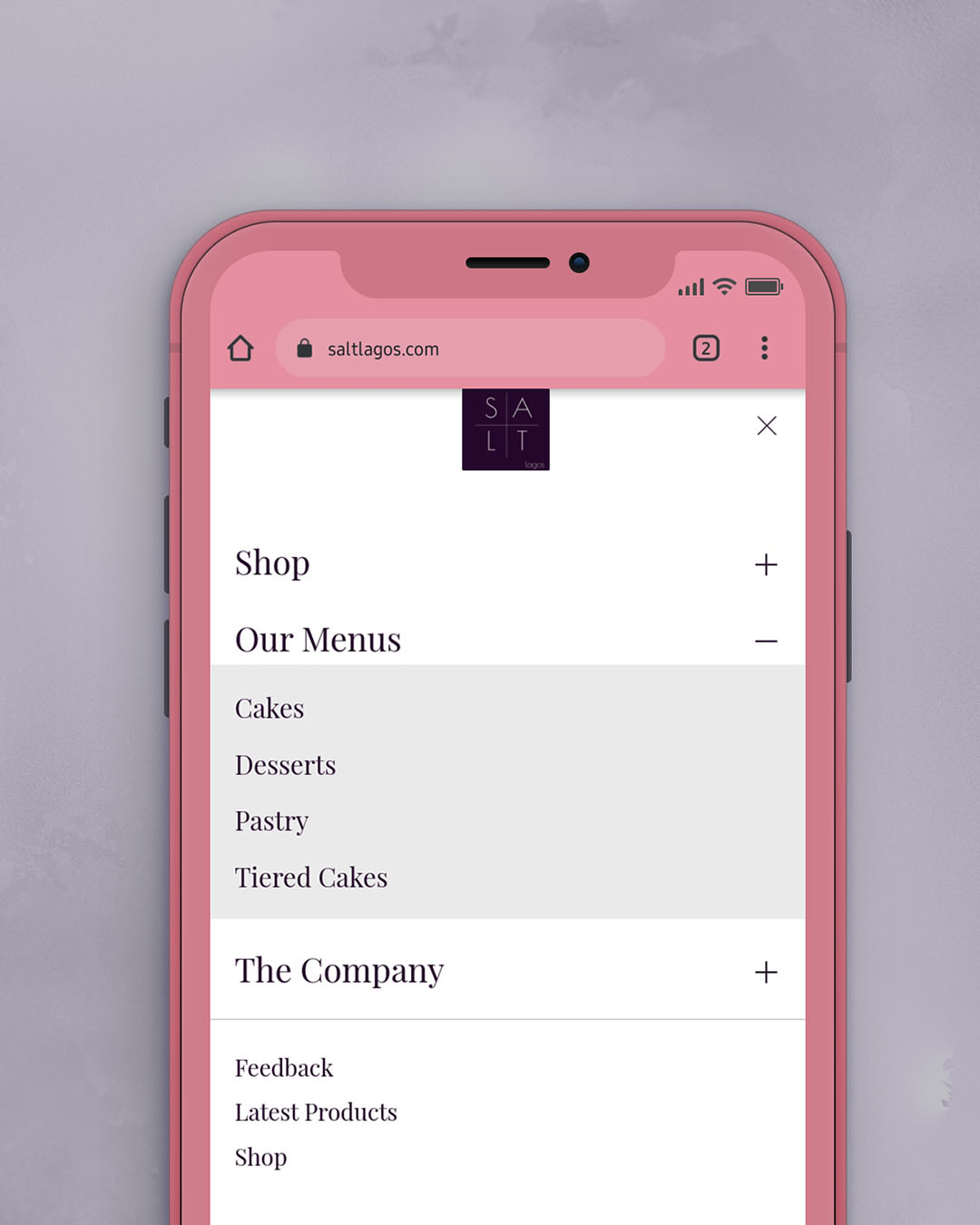
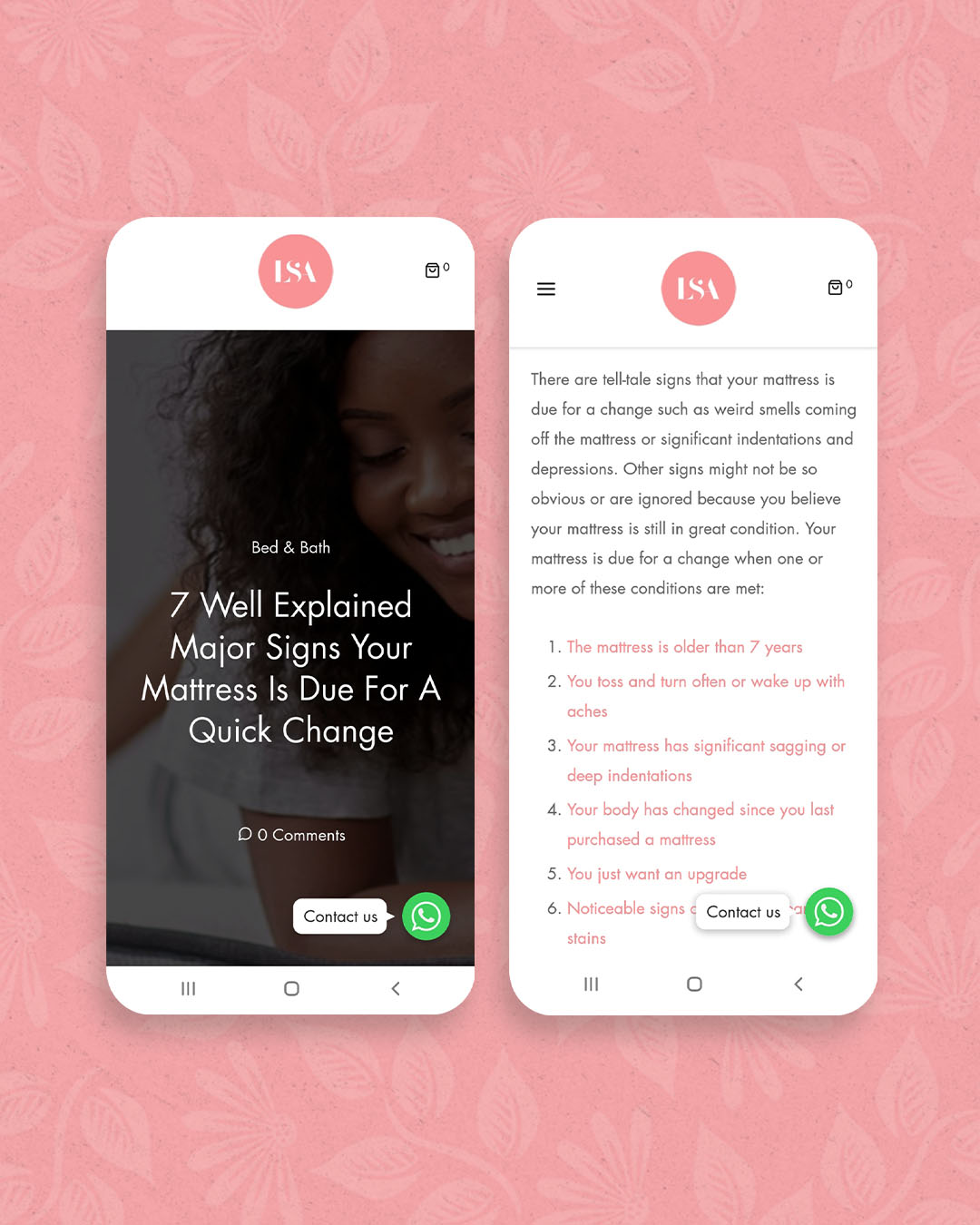
A website can often be the first, and only, impression a potential customer will get of your company so making it count is CRUCIAL. A good website is far more likely to generate a positive impression and keep visitors interested in working with you. This is why we have decided to spend some time talking about qualities of a good website.
Websites are crucial to your brand. To be directly honest, it's better not to have a website at all than to have a bad website. If you do have a website, then it should be visually appealing, clean and clutter-free. It’s usually seen as a reflection of your business/brand, your products and your services. It practically helps to #IdentifyYourBrand.
We are taking a quick look at 3 key qualities of a good website in this article
1) Your Website Should Be Readable
2) Your Website Should Be Well-Formatted
3) Your Website Should Be Mobile Compatible (aka Responsive)
Let's get started.
You are currently reading part 1 of a post series. We delved into some more qualities in the second part of this series. See Qualities of a Good Website Part 2 here.
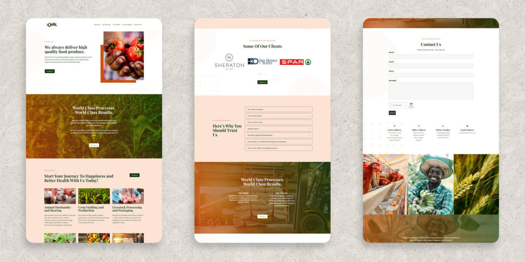
1) Your Website Should Be Readable
TEXT: The most easily read combination is black text on a white background, but many other color combinations are acceptable if the contrast is within an appropriate range. Use fonts that are easy to read and are found on most of today's computer systems. Don't over do it.
Graphics: Graphics are quite important, as they improve the visuals of your website. However, just like text, don't over do it. Don’t load any one page with more than 2 or 3 graphics if your content doesn't require it
Photography: This is a no brainer in the world we live now. People want you to SHOW THEM instead of TELL THEM. A simple way to increase your website's visual appeal is to use high quality photography. High quality product images are especially important for eCommerce sites.
2) Your Website Should Be Mobile Compatible (aka Responsive)
Majority of your users will access your website via mobile. It's the order of the day and you must be ready for this because more people use their mobile phones to access the Internet than any other device. So, creating a mobile optimized website has become a necessity today.
One way to check the compatibility of a website is to simply open it on your mobile phone and see if it looks okay and everything important is showing up. If its not properly displayed on a phone then it has to be corrected as your visitors will not remain on the site for long when it displays awkwardly. A responsive website changes its layout and options to fit the device and browser size. For example, a website may provide more options on a large PC monitor compared to on a mobile phone.
The simpler your website is on a desktop, the better the chances of it doing and looking better on mobile devices like phones and tablets. This makes it critical to keep your website clean, simple and direct to the point.
3) Your Website Should Be Well-Formatted
The first thing a user does to a blog post is to skip through to determine its relevance. They will not read every single word. Its therefore important to set your blog posts up into sections. We recommend the following
1) Using 30 words per paragraph
2) Having 2 paragraphs per section
3) Use headings and subheadings per section
4) Use bullets or lists per section
5) Use a relevant photo after each section
All these, and more of course, will help you break up the text in your content and make it easy for readers to go through quickl3y.
Quick, Easy to update and Mobile Friendly websites your customers will love and trust
You are currently reading part 1 of a post series. We delved into some more qualities in the second part of this series. See Qualities of a Good Website Part 2 here.


