We recently had to upgrade our website to improve its performance and features in order to get better results from it. These are the things we found out the during the process and how we addressed them to ensure our website meets our goals.
Key Terms Used In This Article
Problem: The content was not displaying properly on all devices.
Solution: Upgrade the website as updating it was not solving the problem.
Upgrade: Modify major parts of the backend of the website.
Update: Modify the content (text, photos, videos, graphics) of the website.
1) Your landing pages will have new problems
After making a major wordpress upgrade like theme change, check each landing page to ensure the content looks and works okay. A new theme changes the entire look and feel of a website. Be sure it hasn't done more harm than good by checking your landing pages to ensure the text and images are displayed properly. Make any changes you need to ensure your website visitors can consume your content easily and effectively.
On the homepage we found out that some of the images don't load properly after the upgrade and proceeded to relink them properly. Also some of the text sizing were not consistent, we fixed this by making changes directly on the page and on CSS to ensure those changes are sitewide.

2) Some Call To Action (CTA) buttons will disappear so check and test buttons and forms
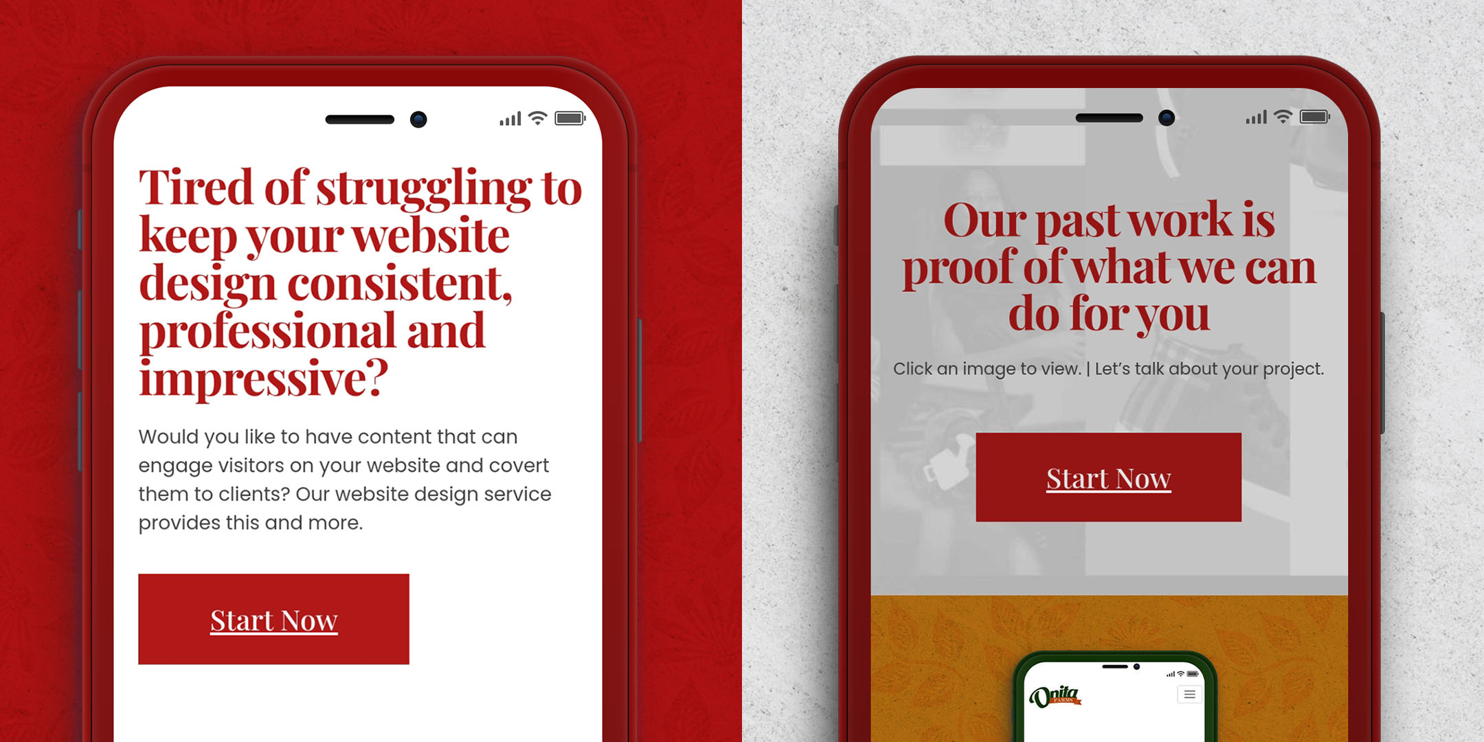
We found out recently on myredboxx.com that some CTA buttons were gone after the upgrade. Contact forms still worked but the lack of the buttons made it harder to get to them. You don't want a customer struggling to reach you. We spent the better part of a day replacing buttons on our Website Management Service landing pages and updating the copywriting to suit current goals. We are at work doing the same on other pages
The best way to generate leads on your website is to make it CTA-centric. This means you should have a form of CTA at every possible turn to ensure visitors can reach you easily. A CTA just what it sounds like – a CALL-TO-TAKE-AN-ACTION. It is a call for a viewer to take a specific action per time. Examples of CTAs are ‘buy now’, ‘add to cart’, ‘select options’, ‘click here’ or ’contact us now’.

3) There is always a new way to make things happen easier and faster
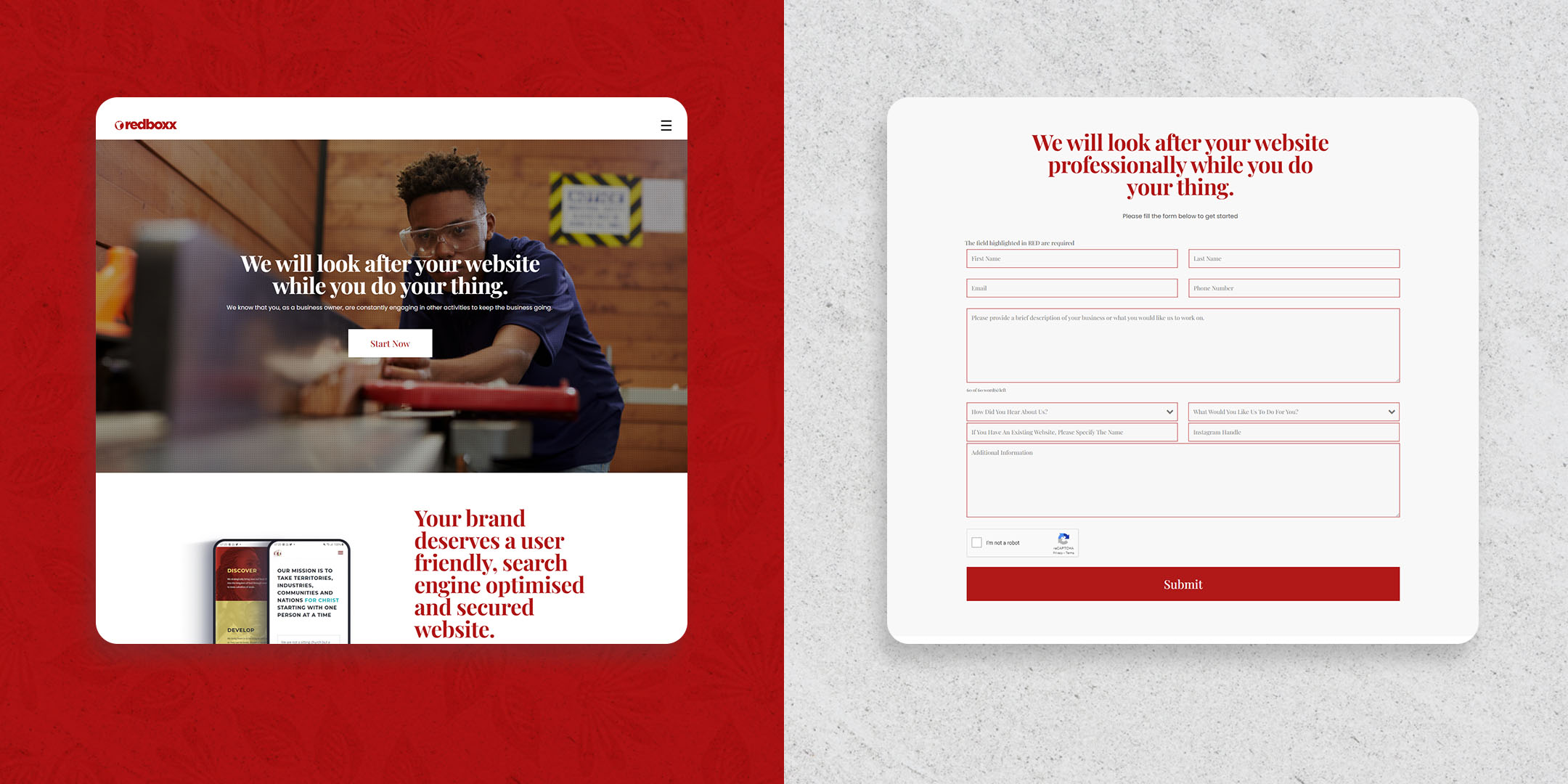
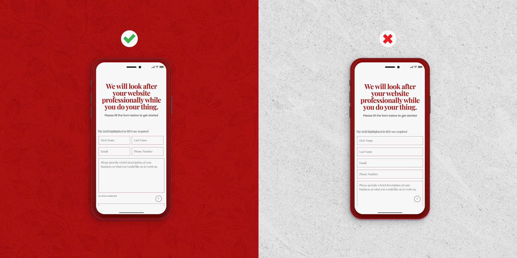
Improve the user experience of our contact forms by reducing the length. We placed some elements next to each other instead of above/below to make it easier for visitors to fill them. You always want easier and faster for your visitors.
We also added a contact form at the bottom of every blog post in a non intrusive way to ensure that if a visitor is interested in working with us after reading a blog post, he/she can reach us without leaving the page.

4) Always find ways to widen your appeal and cater to more types of visitors
In recent years we shared our past work via blog posts talking about how we did a job for a client. We took this storytelling approach to help us generate more leads. It did just that and probably more.
In this new version, we set up a portfolio section on the website that showcases our past work with little or no talk. We did this to cater to people who want to quickly assess our ability to solve their problems. There is no better way to do so than presenting our portfolio.
The storytelling on our blog section remains as is though because that has been a strategy that worked for us over the past three years.


